Do you think your home feels outdated? If you can’t quite put your finger on what’s making it feel that way, we have you covered. This post outlines some design choices that can make your home look outdated, and we also provide some ways to bring a more updated feel.


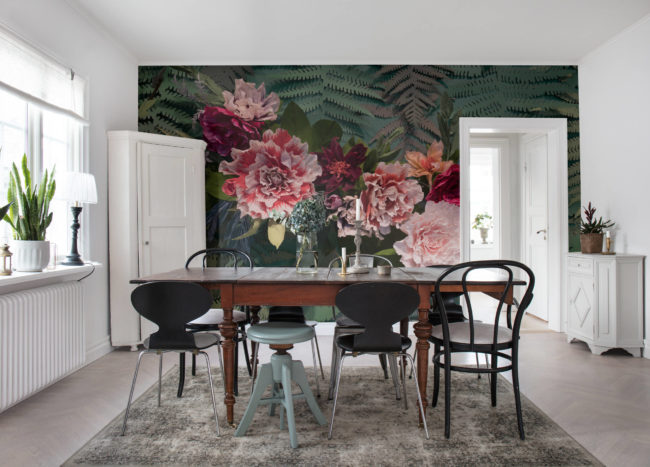
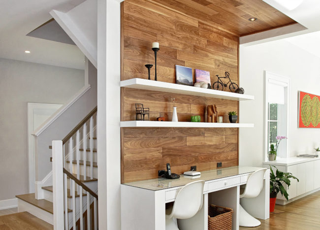
1. Overly complicated light fixtures
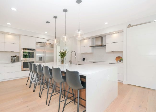
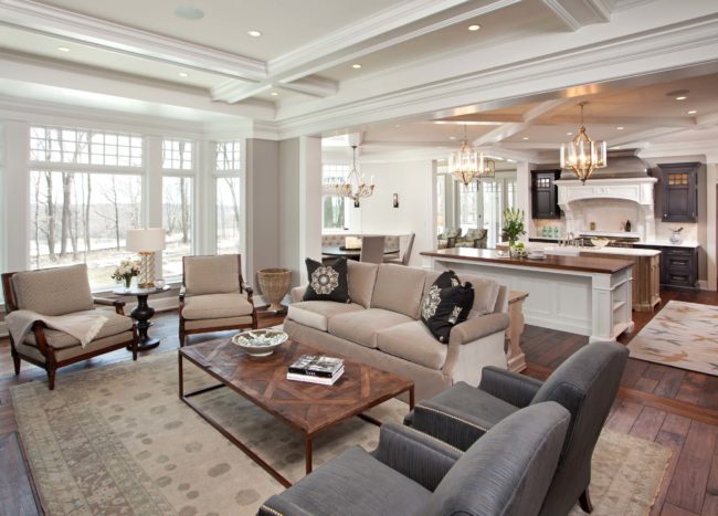
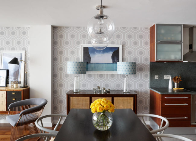
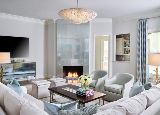
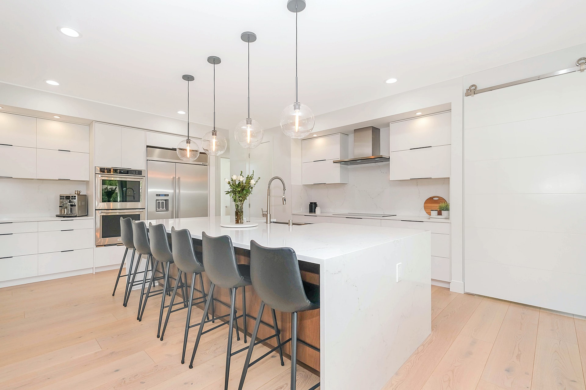
Light fixtures can make or break a room. However, this doesn’t mean that you should pick the most ornate or sparkly chandelier you find. It’s better to use simple designs made of metal and glass for a more classic look.
2. Carpet
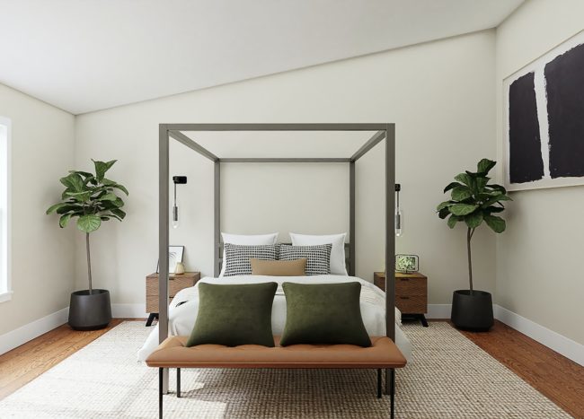
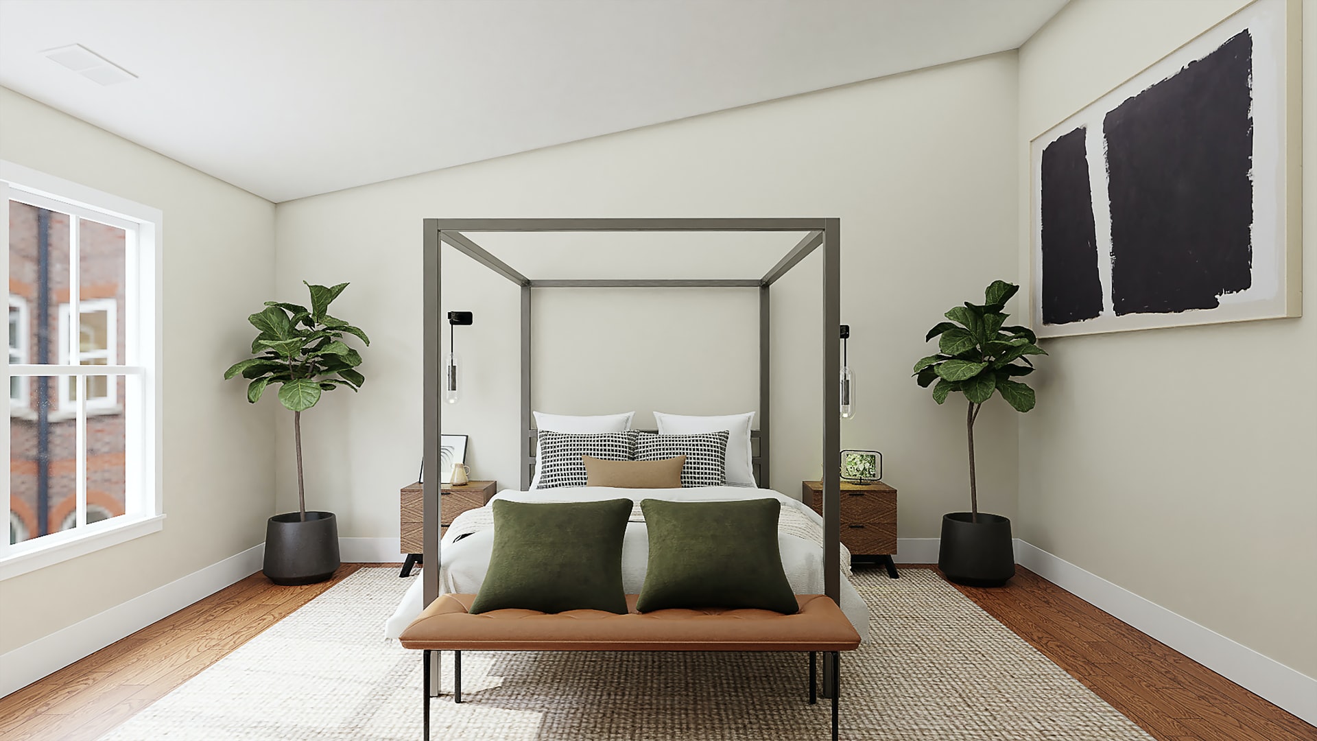
In addition to being an outdated choice, carpet can hold allergens and make your cleaning routine more challenging. More and more homeowners are deciding to ditch the carpet and go for modern flooring options such as hardwood or vinyl. If you still want to add a touch of warmth, it is better to use area rugs.
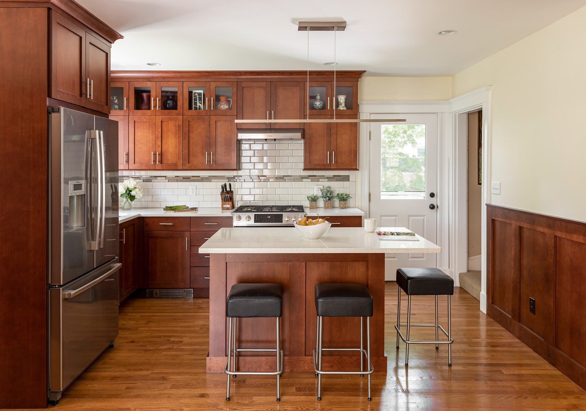
3. Honey oak cabinets
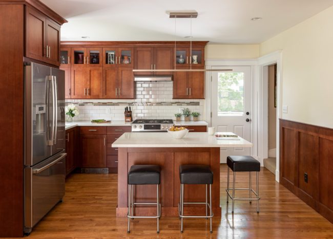
If you still have those honey oak cabinets, your kitchen likely looks outdated. With so many gorgeous stain choices available, you can find one that doesn’t feel so old-fashioned.
4. Clutter
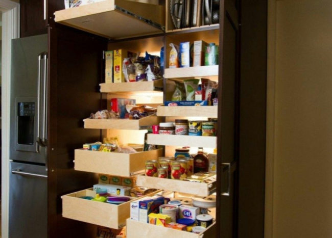
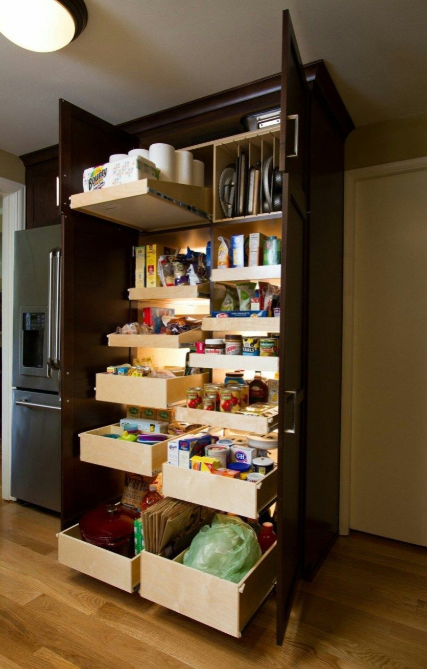
If your home is cluttered, it instantly gives off an outdated feel. It might not be a fun task, but it’s best to take some time to clean and declutter. Next, organize your stuff. Conceal any clutter in decorative wicker baskets, or get furniture with built-in storage options. Don’t forget to organize that cluttered shoe rack in your entryway. By removing the visible clutter, your home won’t look so visually jarring.
5. Patterned sofa
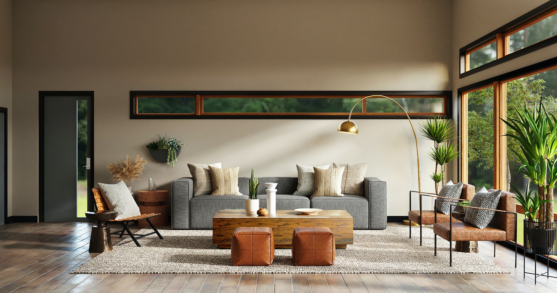
If a ’60s look isn’t what you’re going for, it is better to pick a sofa in a solid neutral. While patterned furniture was perfectly stylish back then, now it is considered an outdated choice. You could even reupholster your old furniture.
6. Toilet rugs
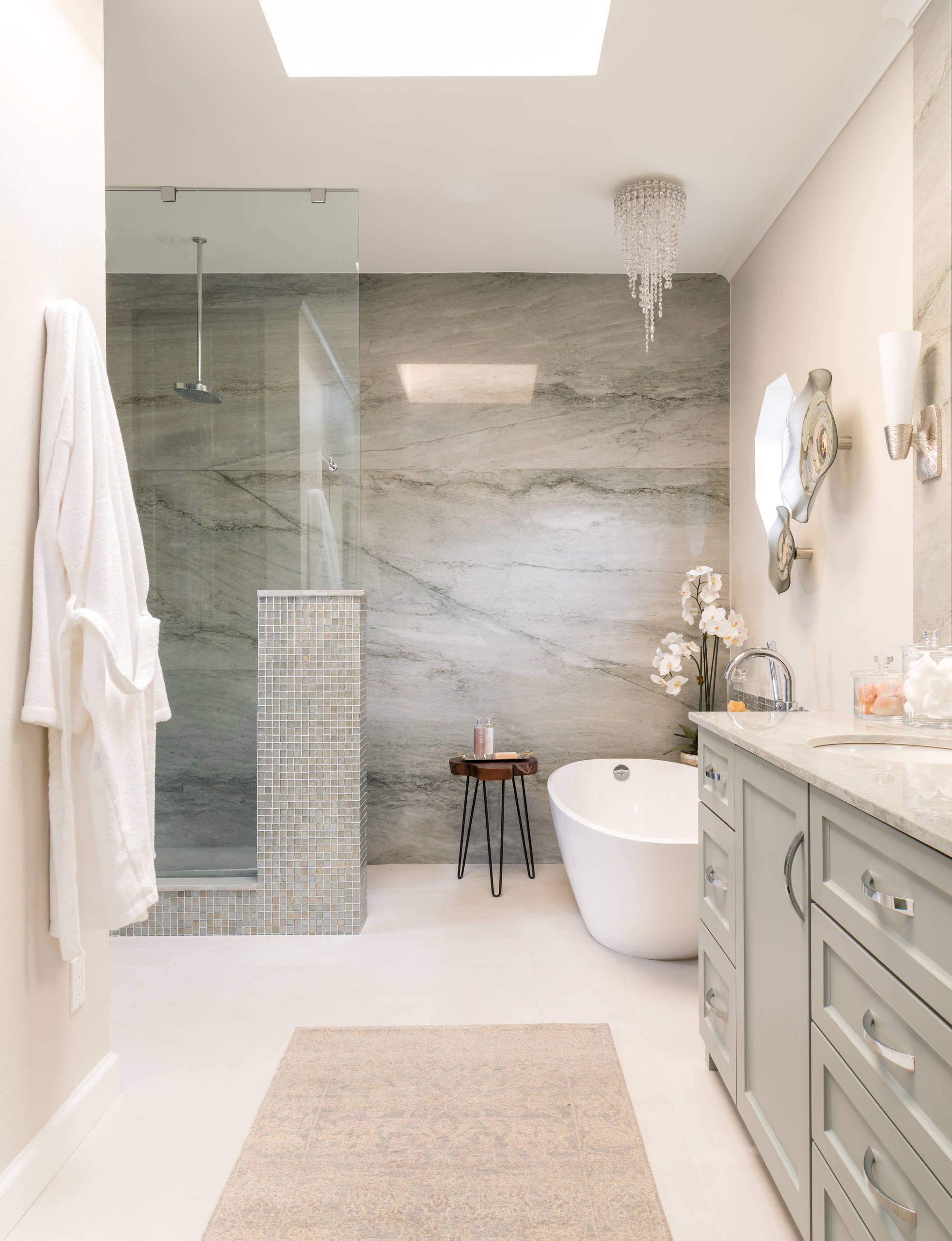
Those fluffy toilet rugs used to be trendy, but they should stay in the past. If you want to add a touch of warmth to chilly bathroom tiles, it is better to opt for modern and more sophisticated choices.
7. Lace curtains
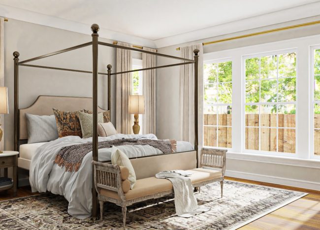
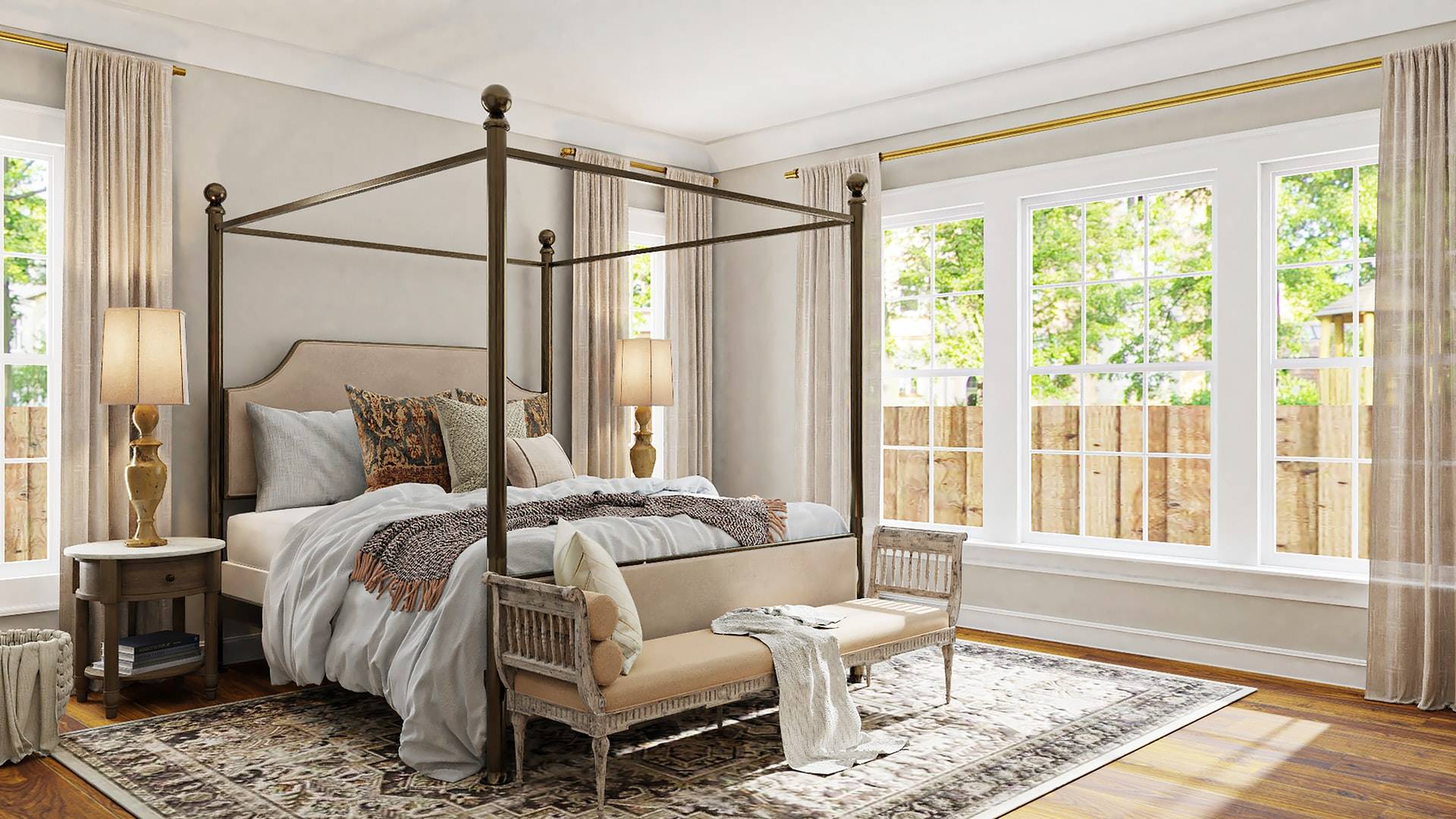
While lace drapes used to be a popular trend, they are best avoided today. Instead, add linen or sheer white curtains for a modern feel. Also, the length of the curtains will change how your home looks. Floor-to-ceiling curtains will make your home look more luxurious and expensive.
8. Doilies
Covering every surface in your home with protective doilies is a very outdated practice. When you do this, you conceal the beauty of the furniture. Ditch the doilies and conduct regular maintenance to protect your furnishings.
9. Too many framed photos
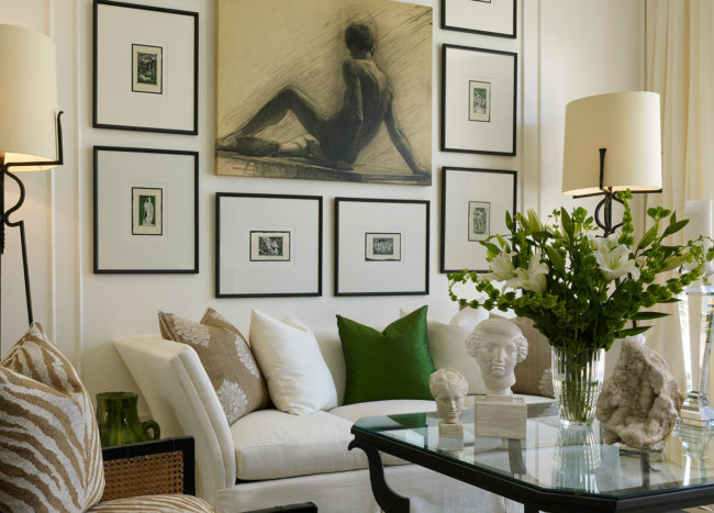
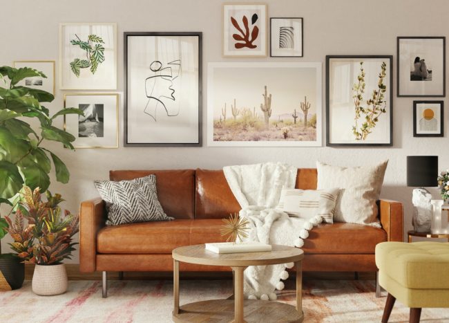
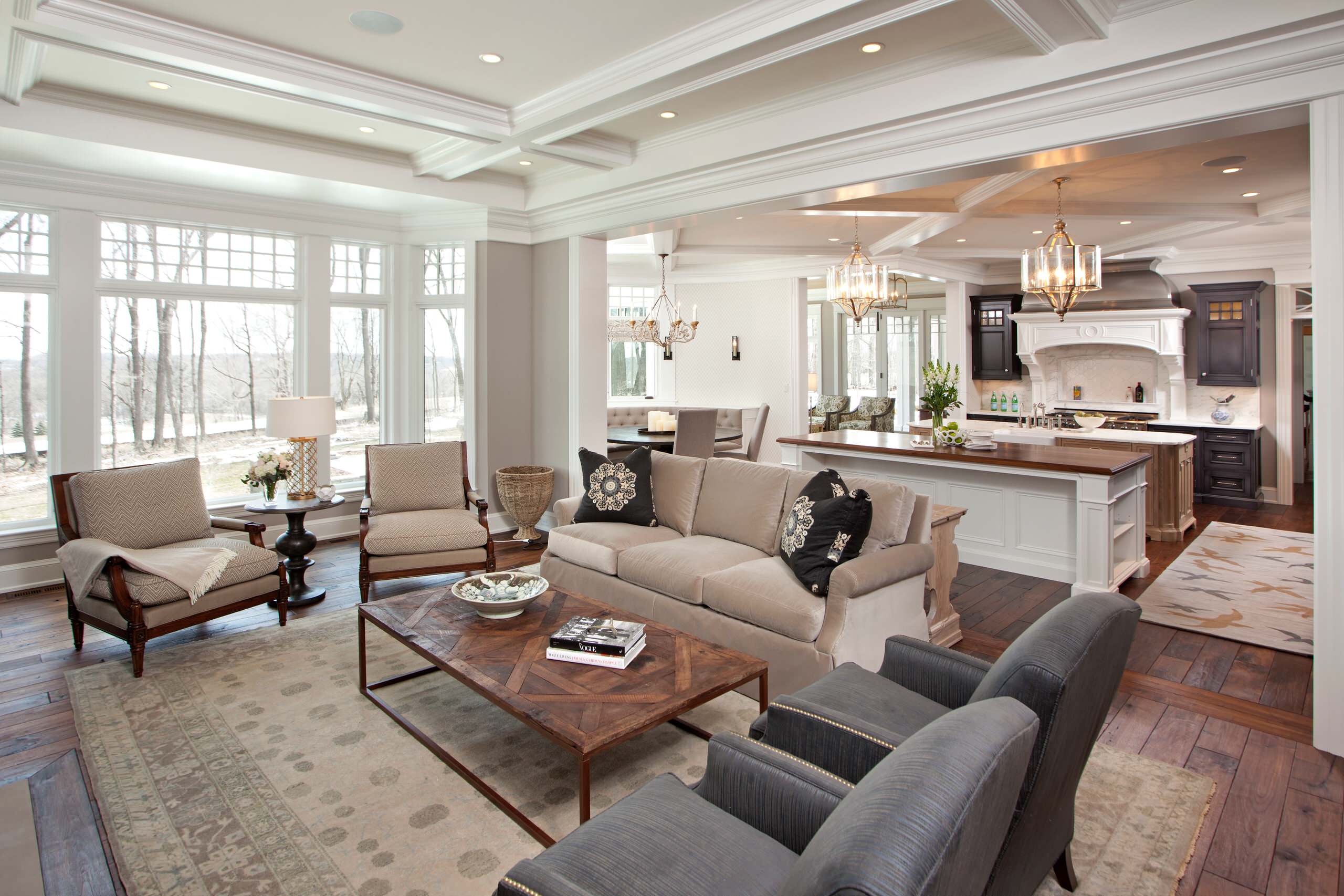
While displaying framed photos is an excellent way to personalize your home, it’s easy to go overboard. Instead, create a nicely curated gallery wall to show off your important life moments. If you have too many photos and want them all shown off, it is better to get a digital frame. They come with enough storage to display a slideshow of your favorite images.
10. Corner tubs
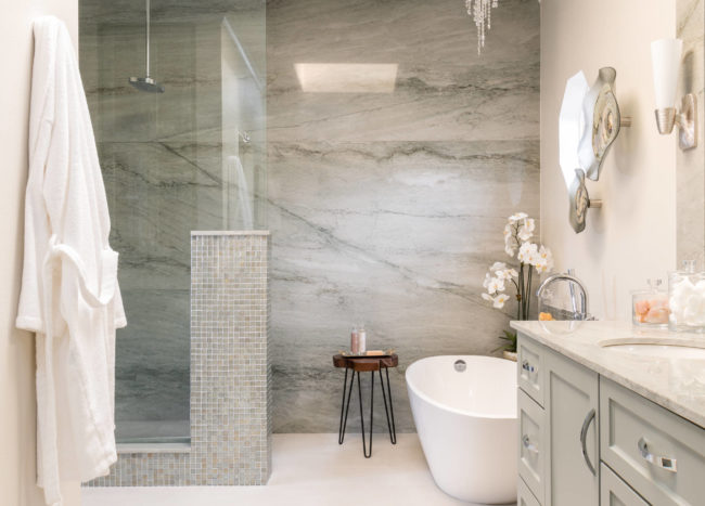
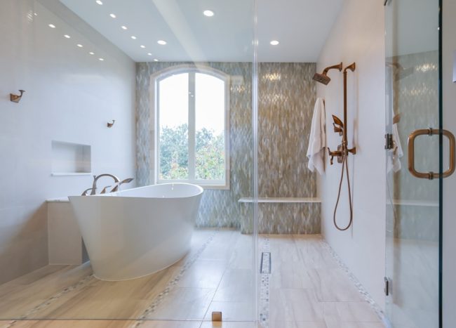
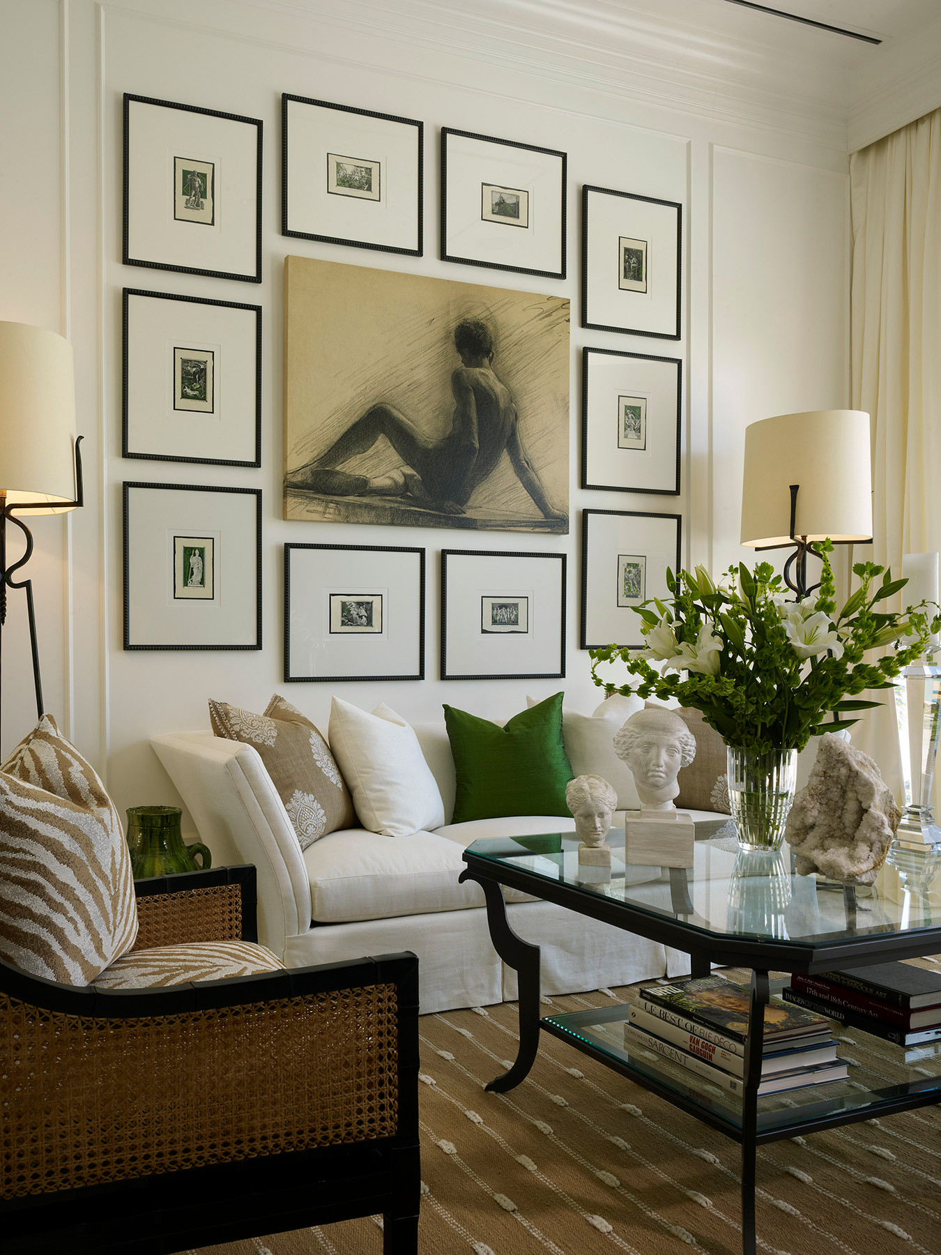
The corner tub is proof that you shouldn’t follow trends blindly. Despite looking spacious, this feature doesn’t provide much comfort. Instead, switch it with a sleek freestanding tub that won’t go out of fashion anytime soon.
11. A too-formal living room
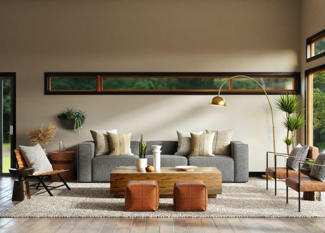
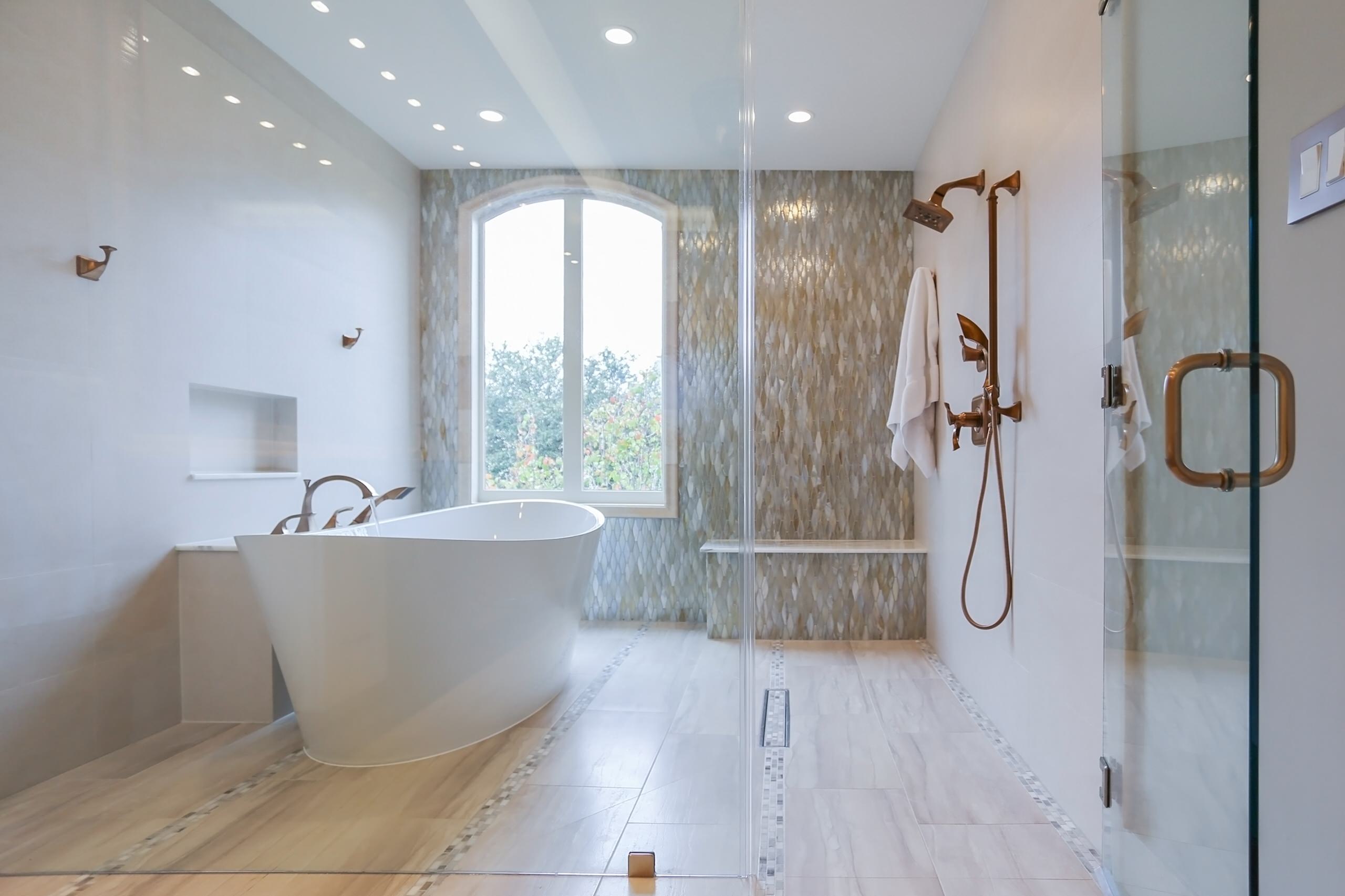
The living room is the central point in the home, where you gather with your family and enjoy. That’s why you should highlight comfort and functionality without going overboard on the formalities. Ditch the extra cushions, as they won’t feel comfy. Opt for function and comfort when it comes to choosing furniture.
12. Fogged shower doors
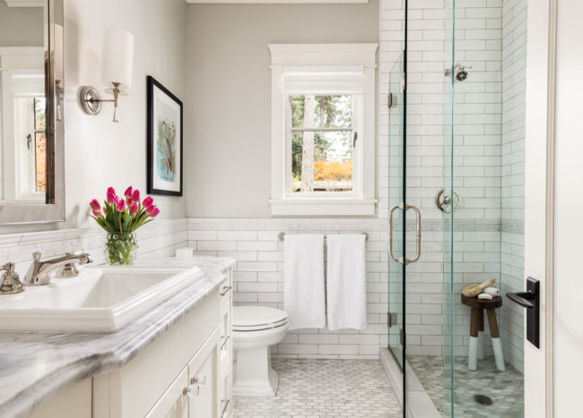
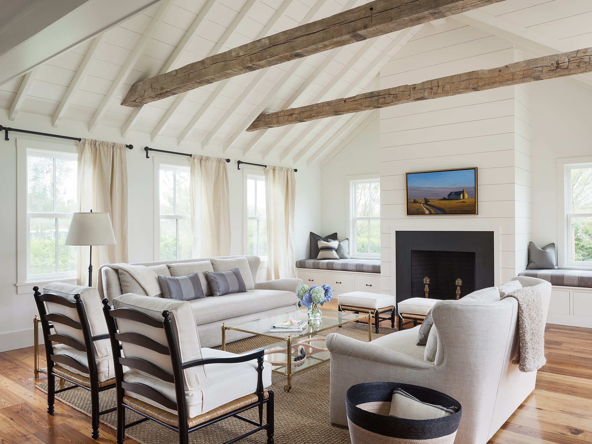
Those shower doors are visually unappealing and are also nearly impossible to keep clean. Instead, opt for frameless doors or a doorless design if you can. This refined design has a streamlined look and doesn’t bring visual clutter.
13. Wallpaper borders
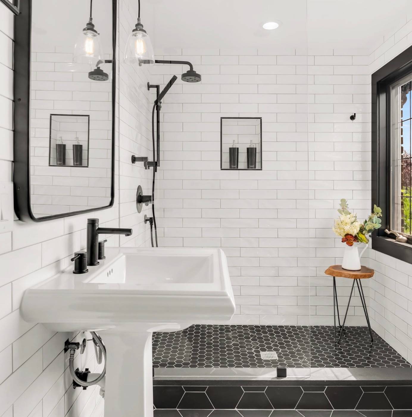
Wallpaper borders can give off the impression that you are in your grandma’s house. Modern wallpaper is stylish enough to stand out on its own, so it’s time to ditch the borders.
14. Plastic sofa covers
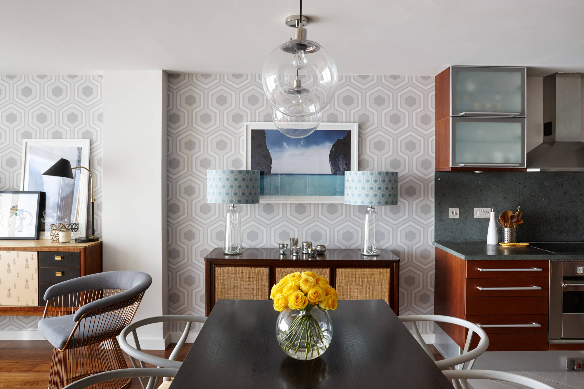
We understand that you want to protect your sofa and make it last as long as possible. However, those plastic covers look very tacky and you should avoid them at all costs. Instead, opt for modern throws that add a touch of style and protect your sofa.
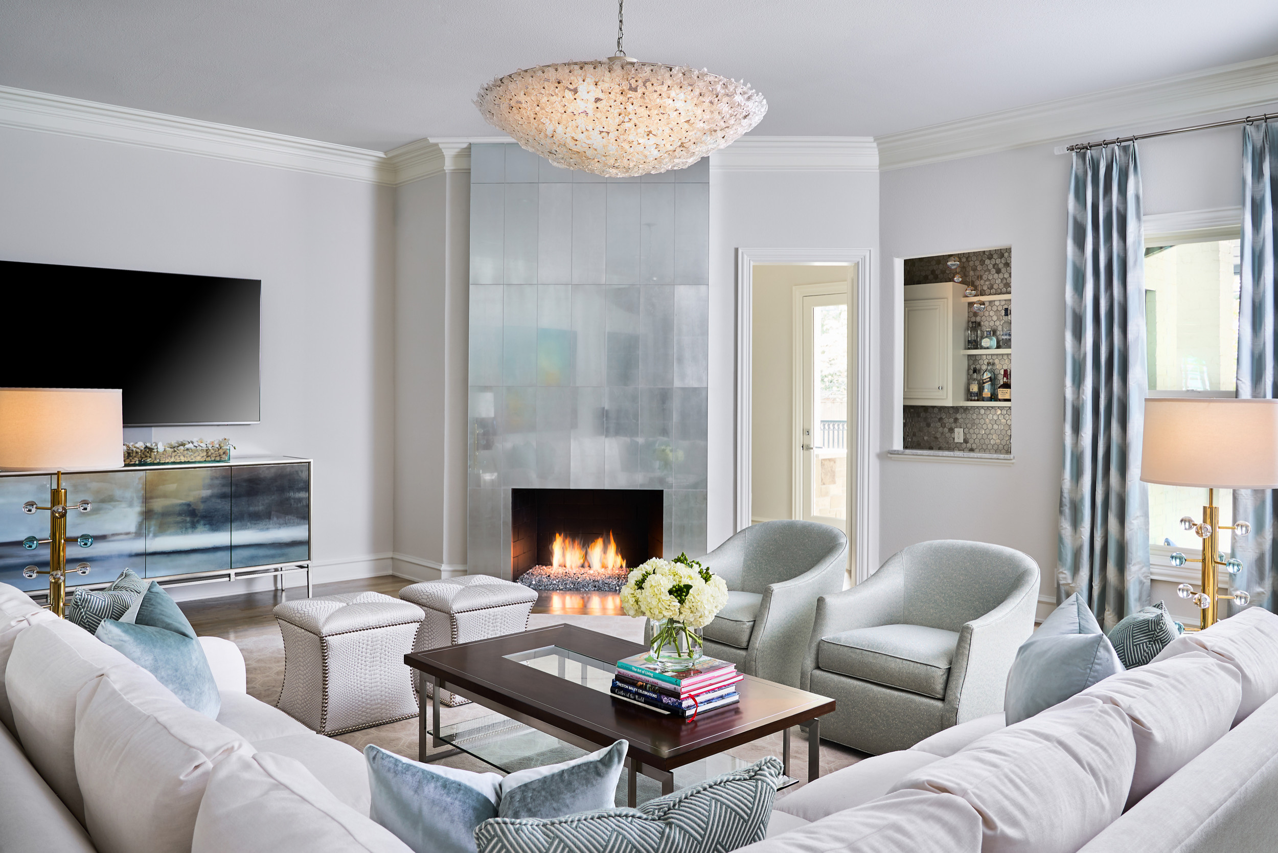
15. All gray color palette
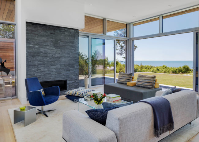
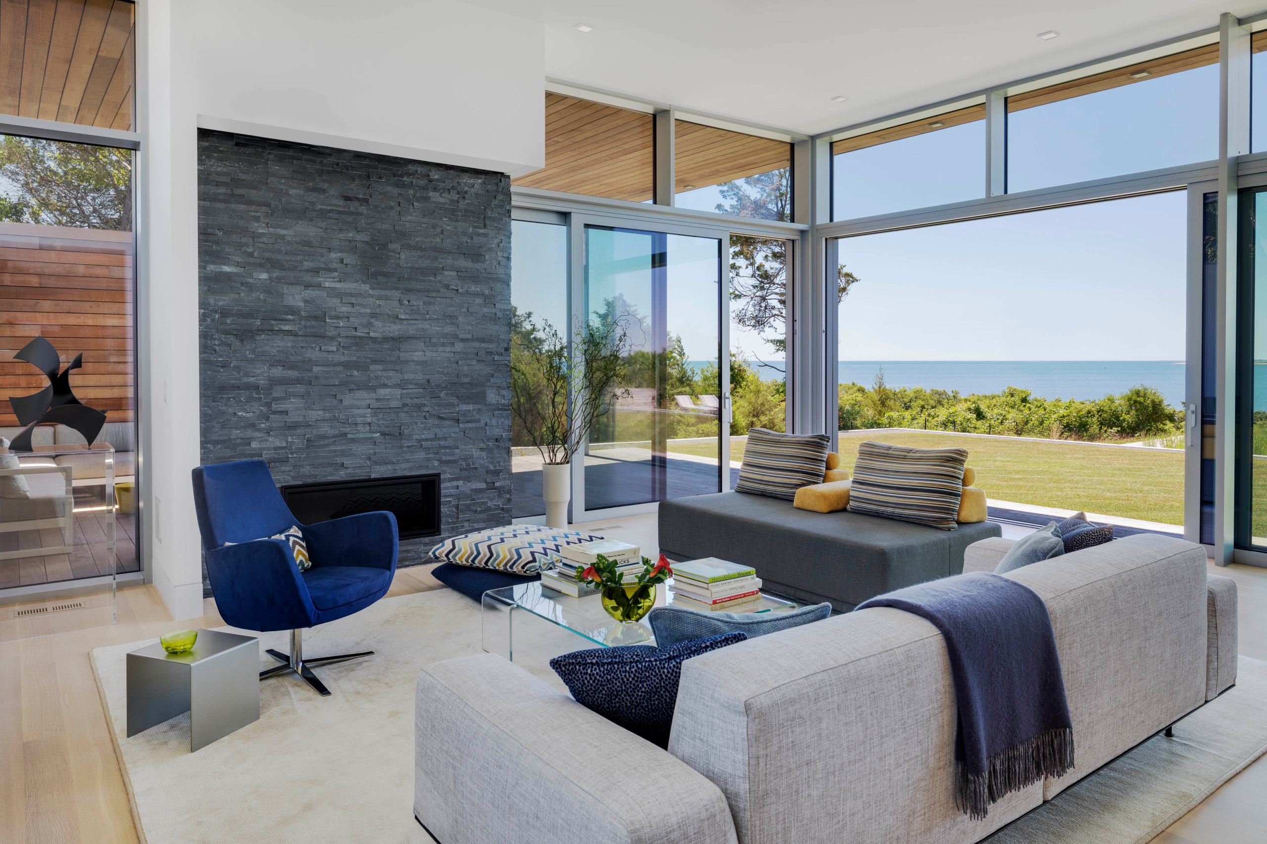
A color palette consisting solely of grays looks so dull. If gray is your favorite neutral and you don’t want to give it up yet, introduce a little playfulness into the space. Add other neutrals such as white, beige, creams, and navy to spice things up.
16. Farmhouse decor
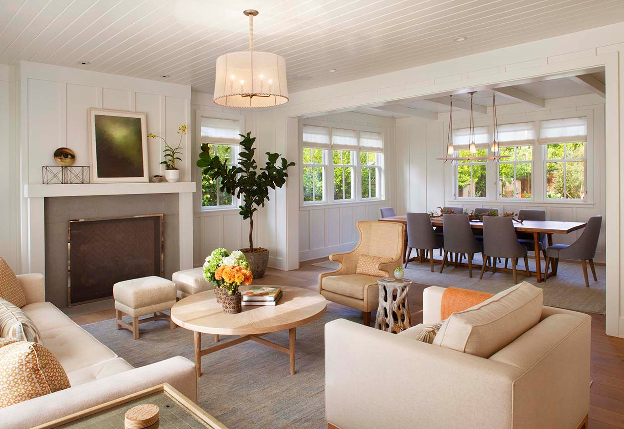
Traditional farmhouse decor feels very outdated. If you still want that cozy feel, introduce elements of the modern farmhouse style.
17. Fake plants
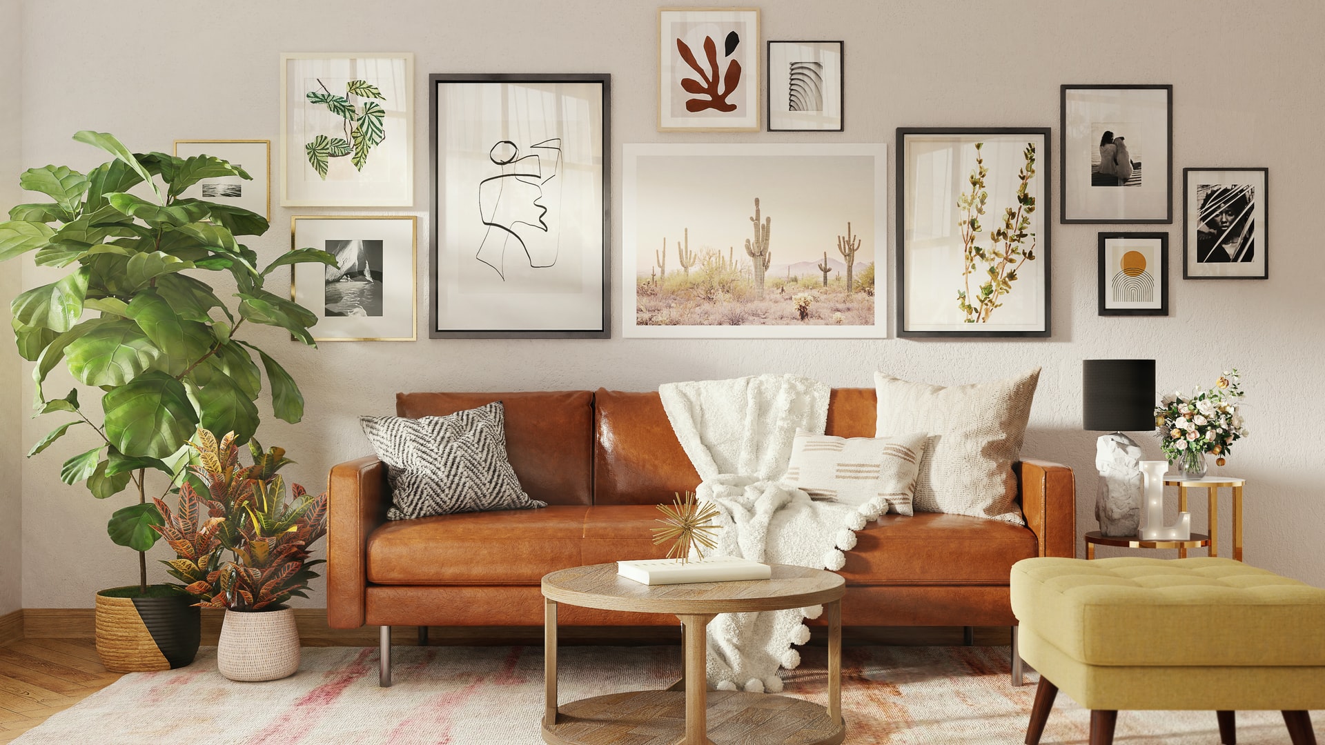
If you struggle to keep your house plants alive, you might be tempted to add freshness with faux ones. Don’t! Remember, having no plants is better than having fake ones.
18. Greige tiles
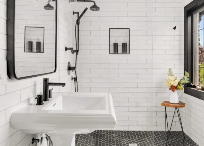
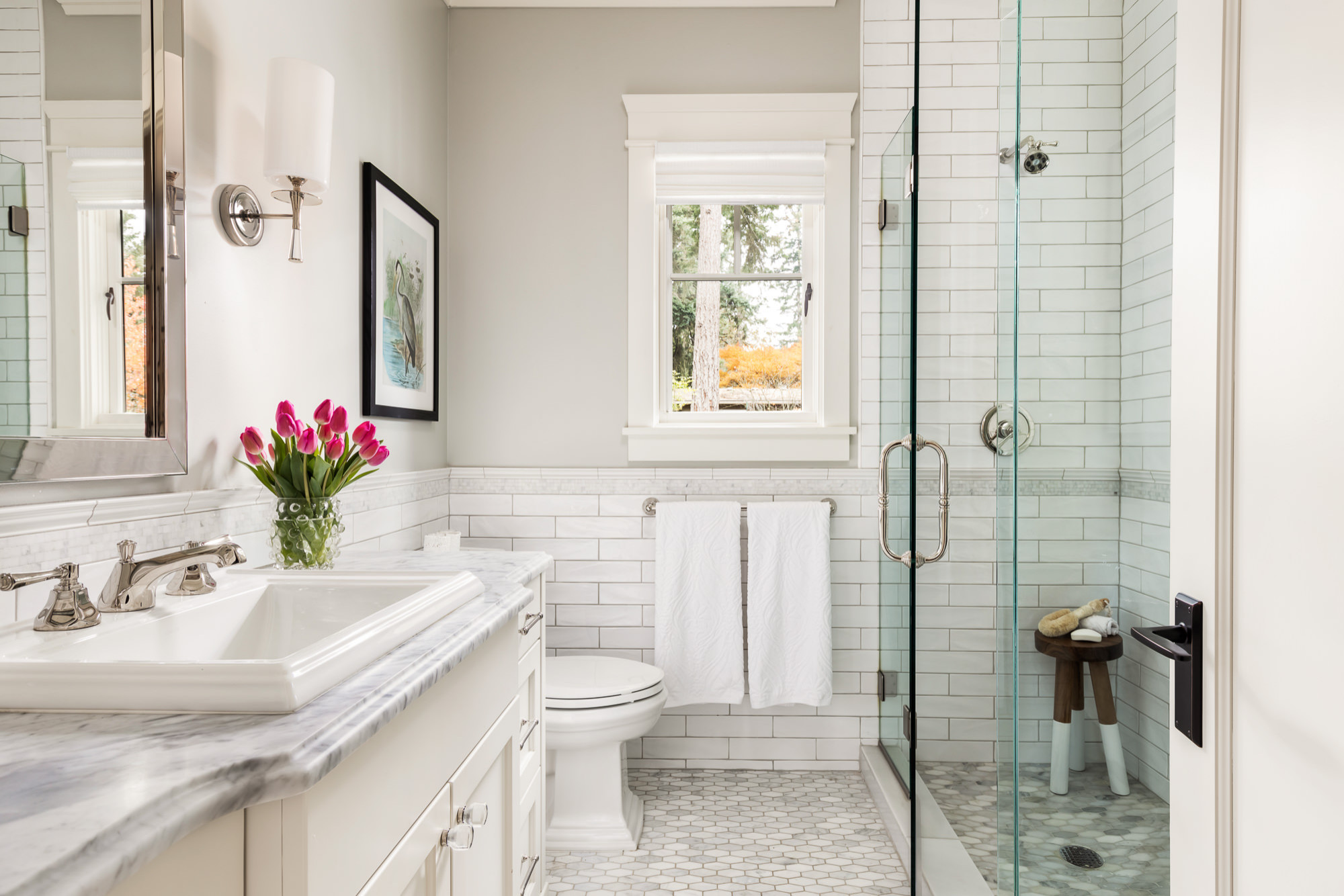
If your home still has that builder-grade tile, it likely has a dated look. The color doesn’t seem to fit any color scheme, so replacing the outdated tiles is a good decision. White subway tiles are timeless classics that look stylish and won’t go out of fashion anytime soon.
19. Wall decals
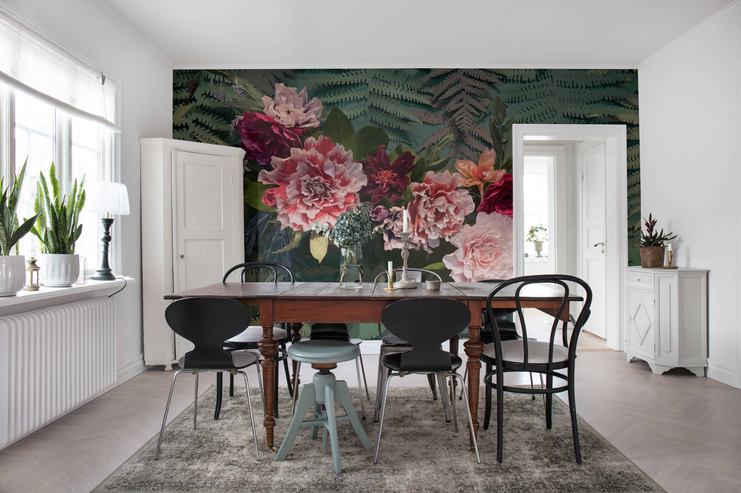
Wall decals were once a great hit, and not only for the kids’ room. Now, they bring an outdated feel to your home. Switch them out with patterned wallpaper or a mural that makes a gorgeous statement.
20. Wood paneling
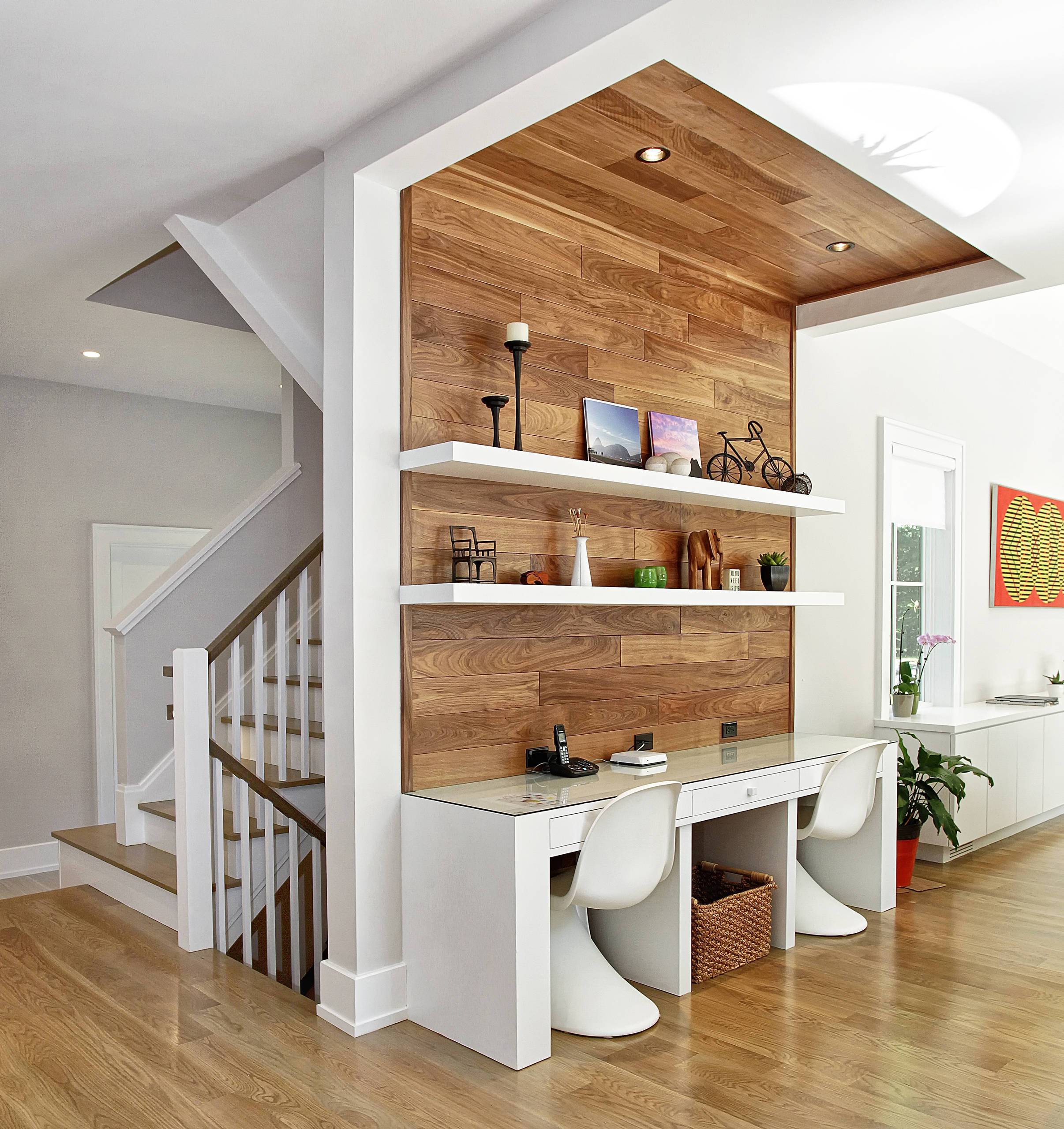
Even though wood paneling used to be quite popular, it is widely considered outdated now. This feature limits your design options, so feel free to remove it. Also, darker paneling will make your home look dingy. Switch with crisp white drywall to introduce an airy feel and instantly update your home.
You're reading 20 Things That Are Making Your Home Look Outdated, originally posted on Decoist. If you enjoyed this post, be sure to follow Decoist on Twitter, Facebook and Pinterest.
