Most people renovate because they want things to look new. But when Mark Lewis renovates, it’s just the opposite. “My ethos is to really respect the architecture, respect the age of the property,” shares Lewis, who founded his eponymous firm in 2008 after spending his 20s styling wardrobes and sets for commercials. In 2017 he launched his home store, focusing on sand-cast bronze hardware, from shelf brackets to curtain rails to cabinet knobs, because if there’s anything he learned from redesigning his Victorian house in North London, it’s that old-looking finishes are hard to come by. “I never want anything to scream ‘shiny,’” says Lewis.
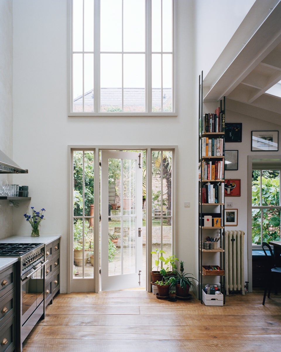
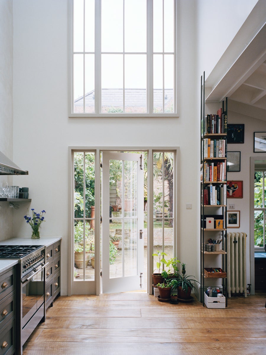
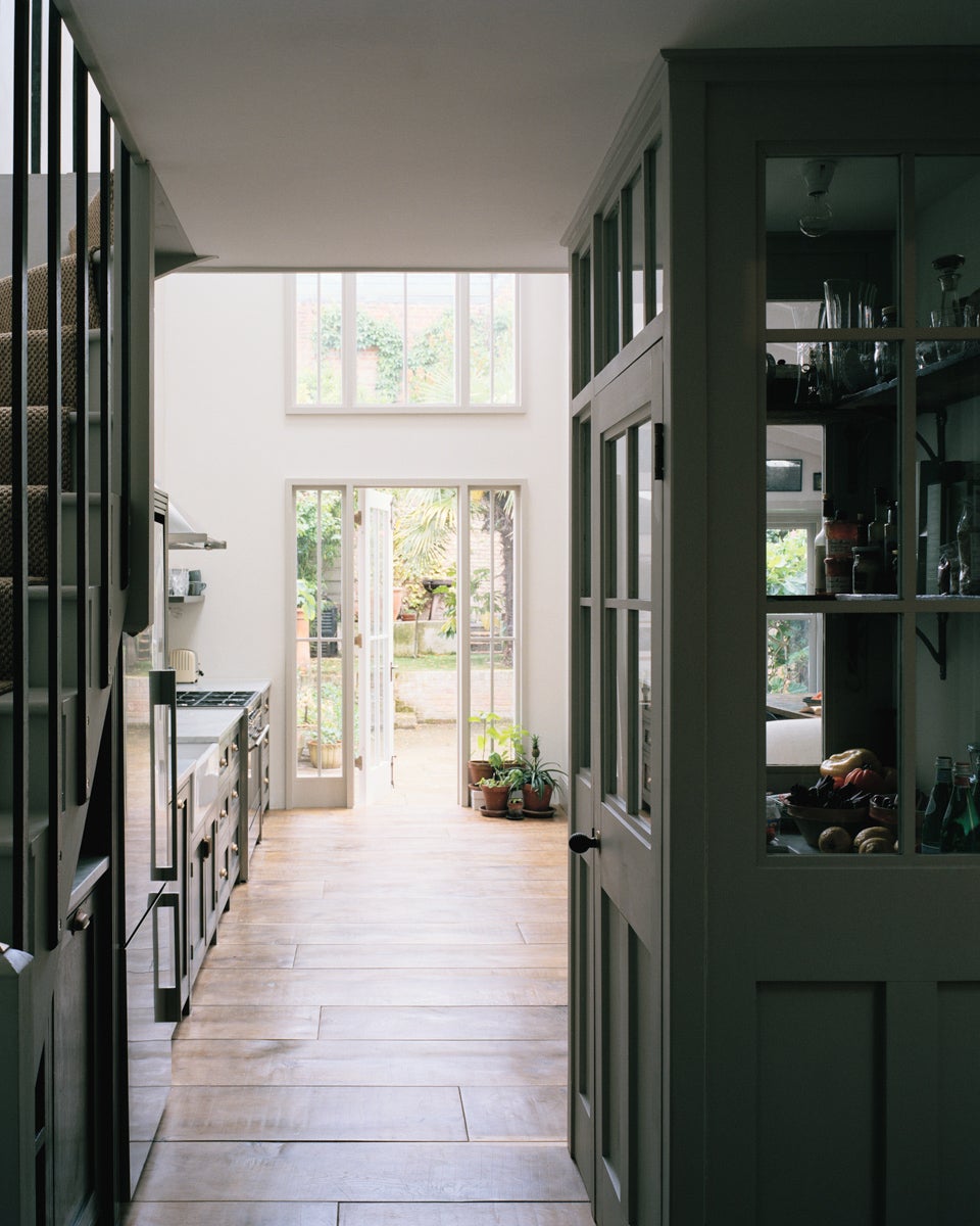
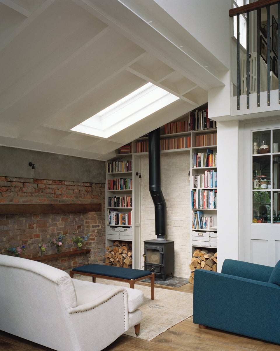
The most modern thing about the row home is the fact that he and his partner, Abi Leland, expanded the space. In 2010 they started with the garden-level apartment and waited patiently for five years until the young couple in the unit above them moved out. “We made it clear to them that if they wanted to sell that flat, we’d buy it for more than anyone else,” Lewis recalls. “It was worth more to us.” An eight-month-long remodel ensued: The couple and their two kids, James (now 13) and Olive (now 7), moved into a place around the corner while a construction crew knocked through the ceiling into the apartment above, creating a double-height space with tryptic windows overlooking the backyard.
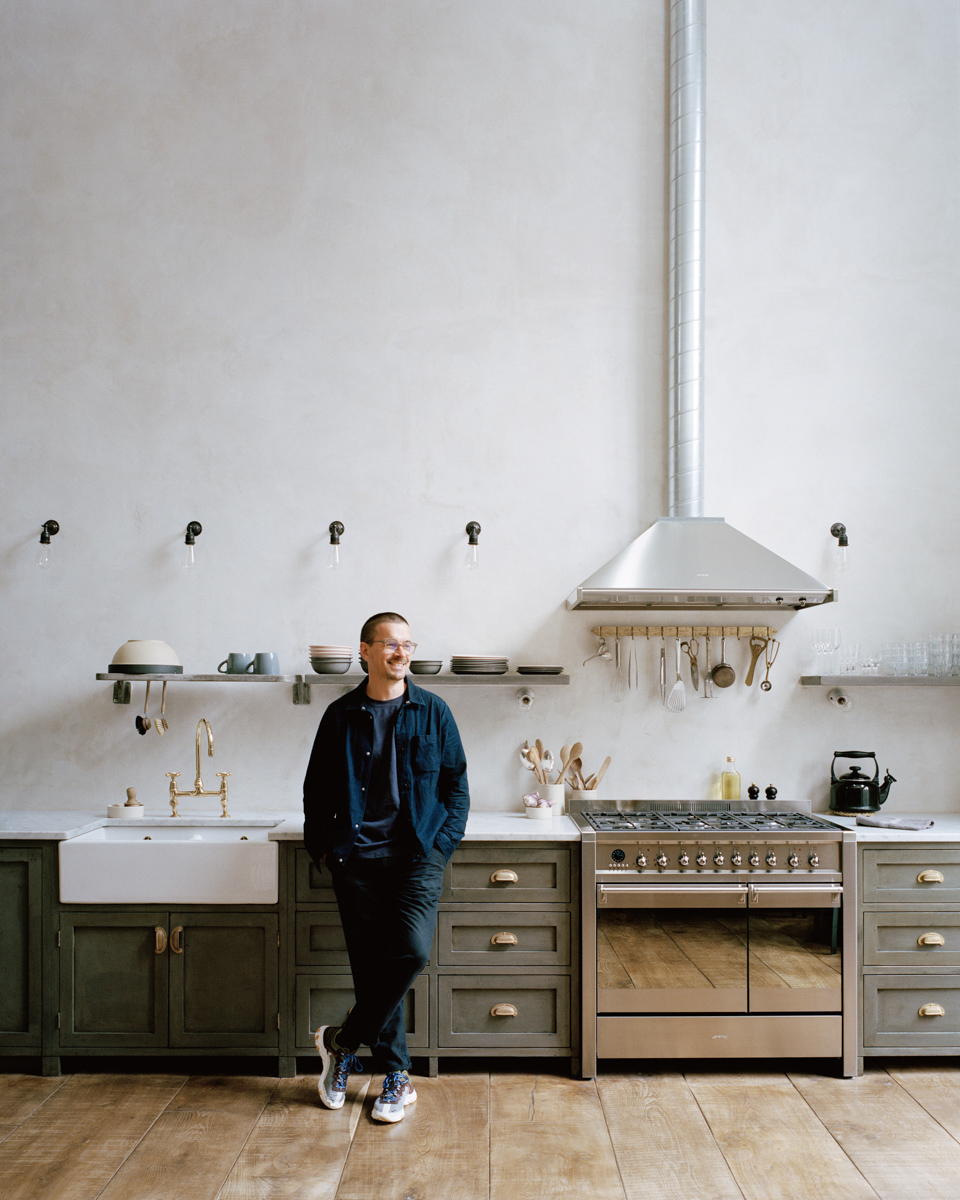
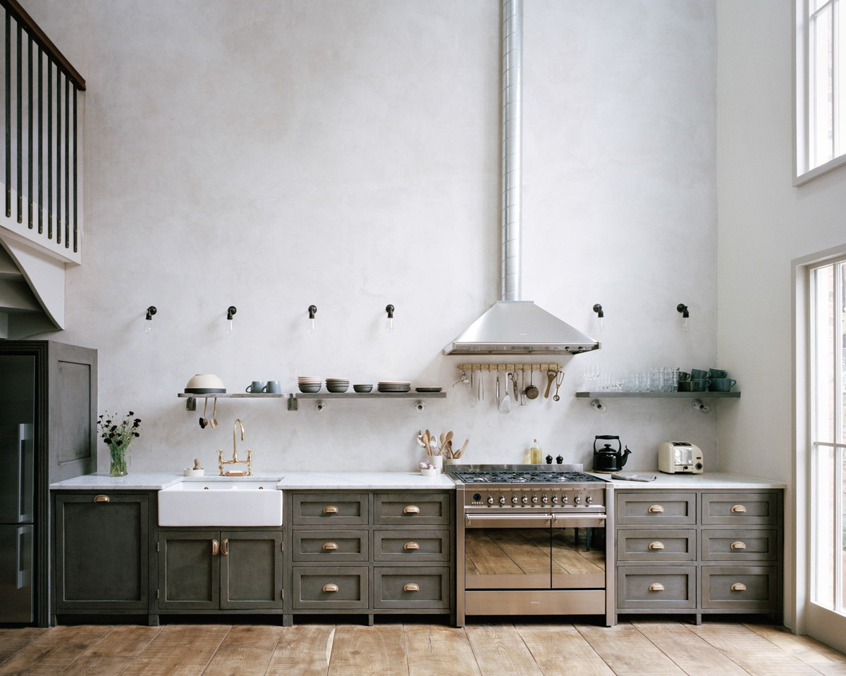
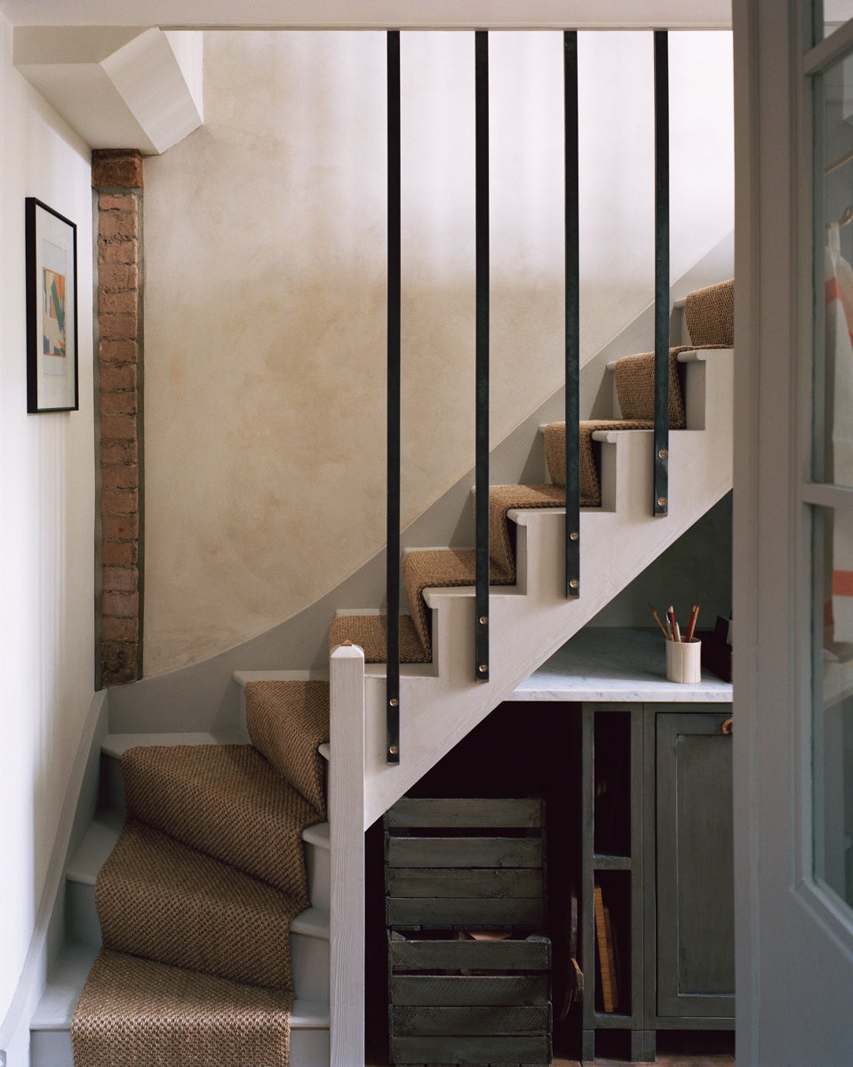
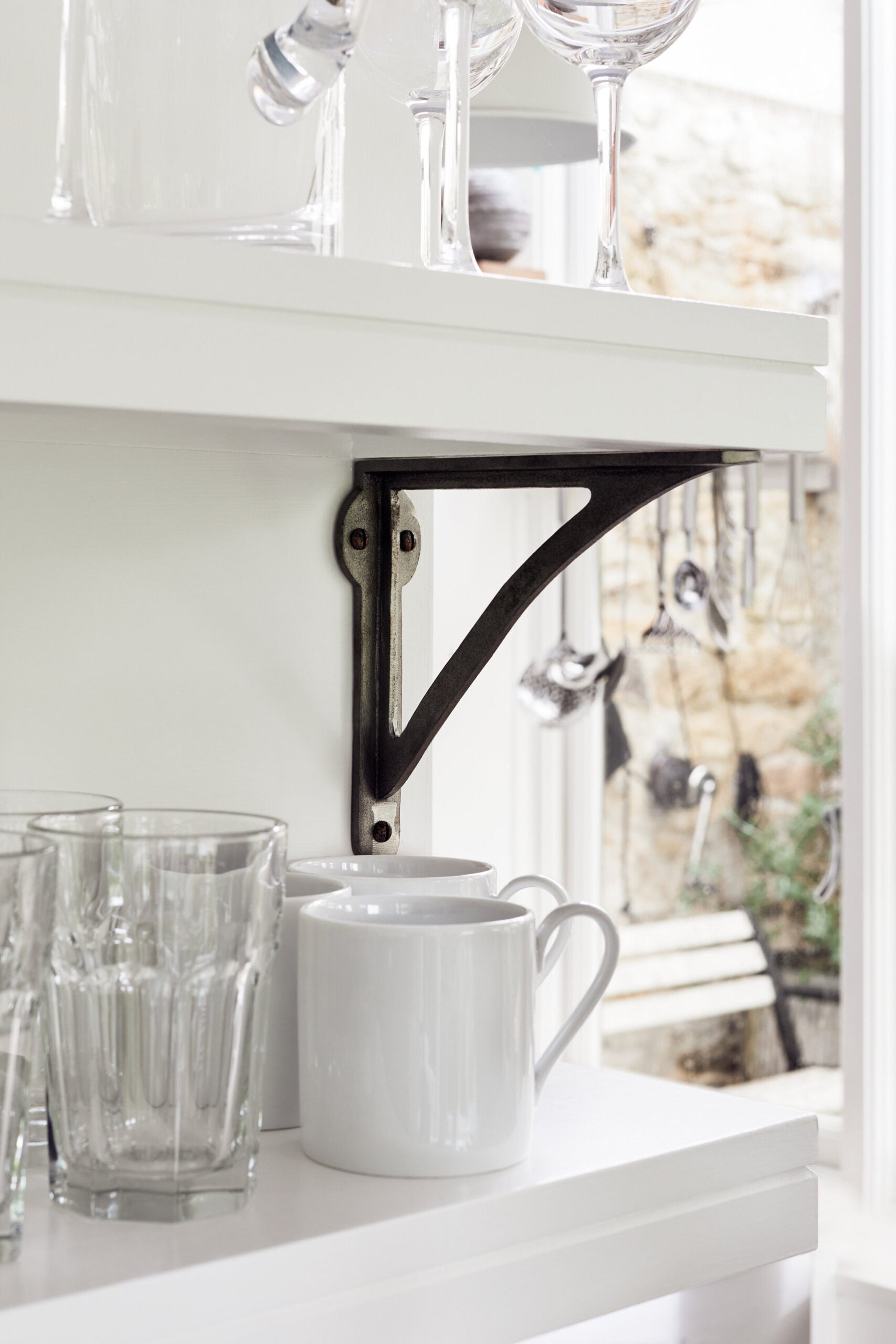
One thing you’ll never find in any of Lewis’s homes is a kitchen island—or upper cabinets for that matter. “I want the kitchen to look as freestanding as possible, like you could pick it up and walk away with it,” he explains. Staying as true to the era of the house as possible meant lining just one wall with base cabinets and mounting single floating shelves no higher or lower than 55 centimeters from the countertop. The base cabinets, which are finished with an aged paint effect and hand-cast bronze cup handles, stretch approximately 8 meters, stopping just under the staircase.
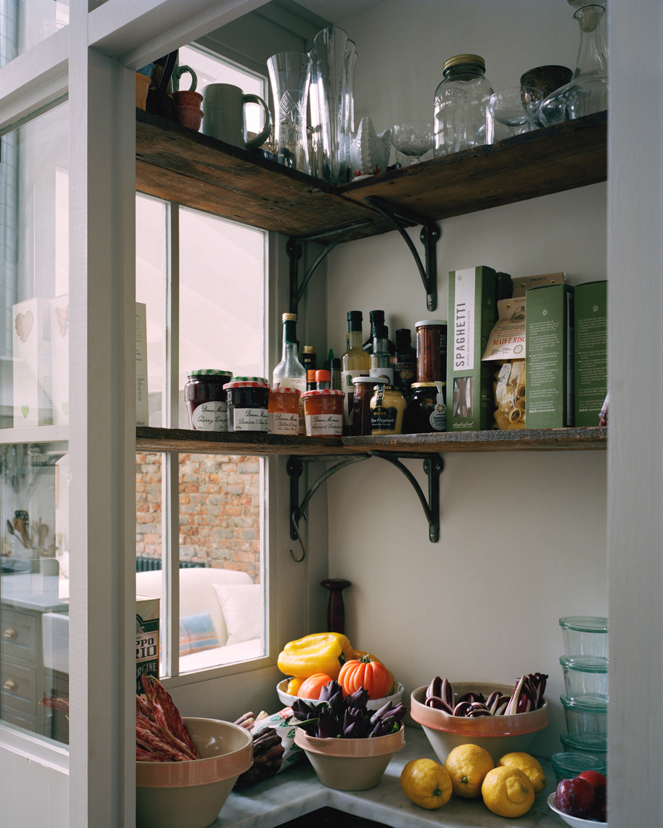
Everything is hardworking, from the task lights under the concrete slabs that cast a soft glow at night to the separate walk-in pantry that’s filled to the brim with fresh produce and lacking in packaging. “It’s like stepping back 70 years,” he says.
Lewis is unsurprisingly also not a believer in TVs (“or emailing or filling out forms,” he jokes), so the cozy living room is void of the black box and instead boasts a wood-burning stove. When the family wants to watch a sports game or gather for a movie, they’ll head upstairs to his son’s bedroom. “He has the biggest TV ever,” says Lewis with a laugh. While James scored the largest bedroom in the house, Olive’s quarters called for clever storage solutions. Lewis devised a custom built-in bunk bed with drawers that fits perfectly in the room’s alcove and topped it with a slightly undersize twin mattress.
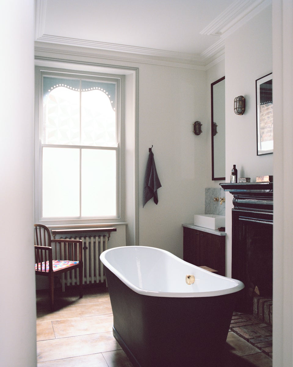
The primary bathroom is arguably his favorite place to be. In the wintertime, a fireplace promises you never have to worry about catching a chill when you hop out of the cast-iron tub. Lewis scored the Art Nouveau–style mantel at a salvage shop years ago. “It was so expensive at the time for me, but I love it so much now,” he says. The vintage French chair in the corner has since been finished with a brightly colored felt cushion, done by friend and artist Laura Lees.
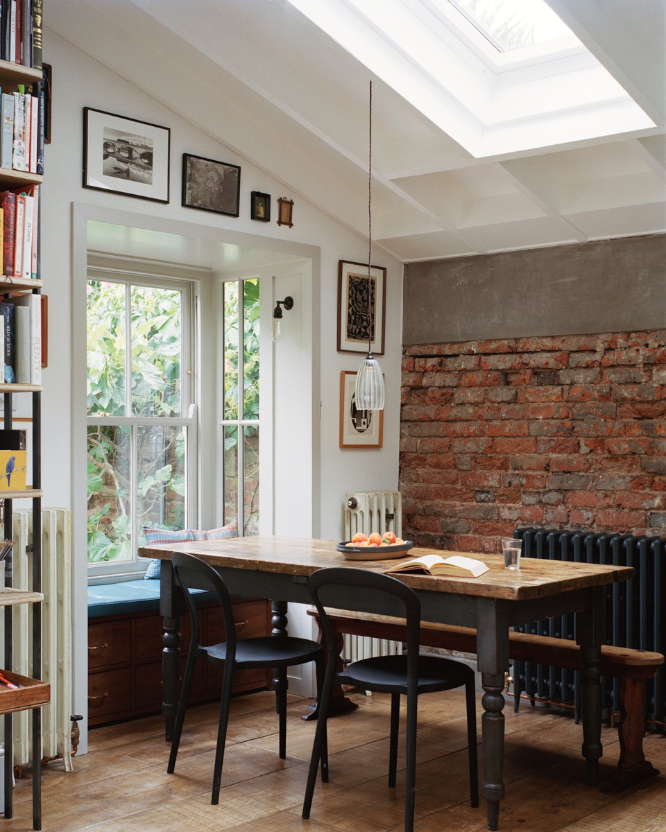
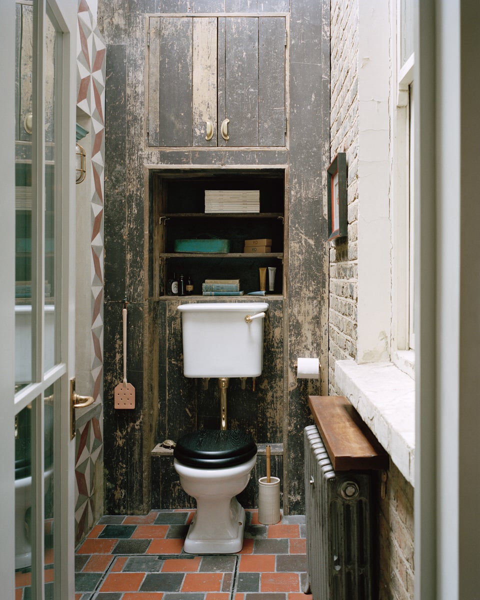
In addition to being an expert on how to make new things look old, Lewis has a knack for scouring for storied gems. The blackened steel stair railings are held in place with vintage brass screws, while the powder bathroom (formerly part of the courtyard) features a mix of reclaimed tiles, the home’s original brick, and wood sourced from their previous kitchen’s floor. “It has turned into a joke that there’s about seven different wall finishes in there,” says Lewis. And each one looks like it’s been there for, well, forever.
The Goods
Where I buy vintage: Retrouvius.
Object in my home that gets the most use: My French frying pans (I have three of them).
Biggest splurge: The mattress in my bedroom was around £5,000, but it is so nice to sleep on.
Best save: The tiles behind the fireplace are green tiles left over from a previous job—we turned them over to show the clay side.
The post From the Utensil Rack to the Tub, All That’s New in This Home Is Meant to Look Old appeared first on domino.

